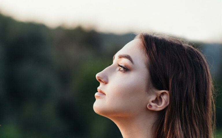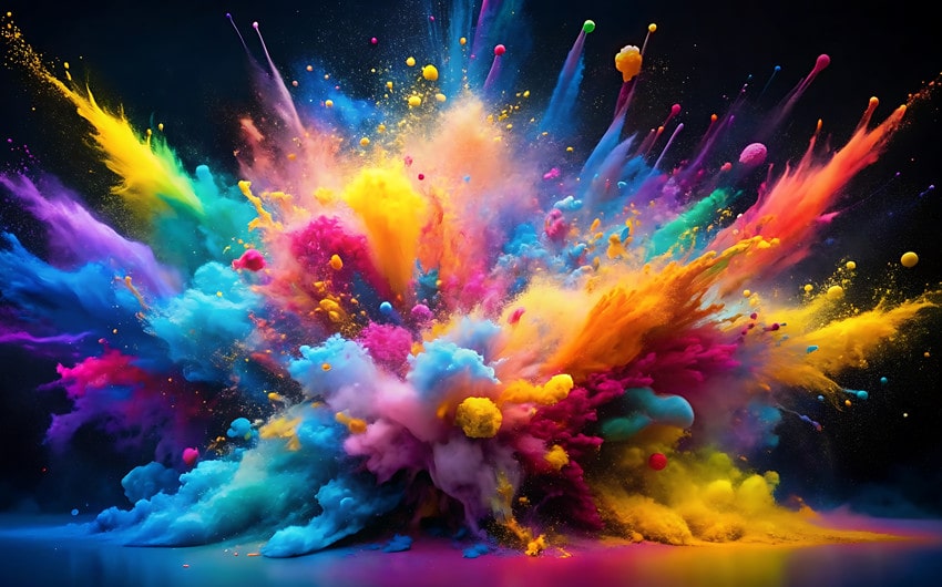
Colors and Emotions: What Each Hue Reveals About Your Feelings
Have you ever said you were “feeling blue” or seen someone “red with anger”? These expressions aren’t just poetic turns of phrase—they reflect the deep relationship between colors and emotions. Color is more than what we see with our eyes; it’s something we experience with our whole body. It can soothe, energize, inspire, or even overwhelm you. Whether you realize it or not, the shades you surround yourself with—and the ones you wear—are shaping your feelings in quiet, powerful ways.
In this article, we’ll explore the emotional language of color, dive into the specific meanings behind each hue, and share practical ways to use color intentionally in your daily life. Let’s unlock the vibrant world of color and emotions—so you can begin to see your feelings in full spectrum.
The Psychology of Color—Why We Feel in Hues
Color psychology is the study of how different hues affect human mood and behavior. While responses to color can be partly cultural or personal, research shows there are universal patterns in how we interpret them. For example, red often triggers alertness or excitement, while blue tends to induce calm and clarity. These reactions aren’t accidental—they’re linked to how our brain processes visual stimuli.
Think about it: warm colors like red and orange are linked with fire and the sun—stimulating, bright, and full of motion. Cool colors like blue and green are associated with water and nature—soothing, quiet, and grounding. When we experience color, it’s not just a visual event—it’s a psychological one.
Understanding colors and emotions allows you to choose your environments, outfits, and even digital spaces in a way that supports your mood. The better you know how each color works, the better you can align it with how you want to feel.
Warm Colors and Their Emotional Energy
Warm colors are like sunlight for the soul. They’re vivid, dynamic, and often linked with energy, joy, movement, and even intensity. These colors—such as red, orange, and yellow—spark emotional responses that are immediate and powerful. When used with intention, warm tones can uplift you, energize your spirit, and even help release emotional tension.
Warm colors tend to activate your sympathetic nervous system, which is why they feel stimulating and vibrant. They’re often associated with fire, passion, love, warmth, and life itself. But they can also stir more overwhelming feelings, like restlessness or frustration, especially in excess. Learning to use these colors mindfully allows you to harness their emotional power in ways that serve your wellbeing.
Let’s look deeper into the emotional landscape of each warm color—and how to bring them into your everyday life with clarity and confidence.
Red – Passion, Power, and Alertness
Red is a color of extremes. It’s the first color your eye notices and the last one you forget. Emotionally, red is tied to primal feelings: desire, courage, love, and survival. It’s the color of the heartbeat and the rush of adrenaline—making it a symbol of vitality and fierce emotion.
Red can be empowering when you need a confidence boost, but overwhelming when you’re already overstimulated. It brings energy to spaces and attention to whatever it’s paired with. It’s often used in marketing because it activates urgency—but in your personal life, it’s better used with care.
Wear red when you need to feel bold or seductive. Add red accents in your workspace or living room to inspire action. But avoid overusing it in restful spaces like your bedroom—unless you’re going for passion over peace.
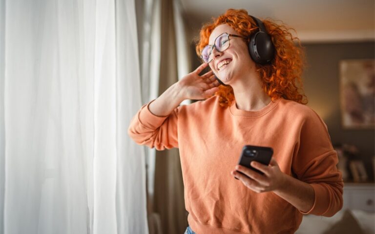
Orange – Joy, Warmth, and Sociability
Orange blends the fire of red with the cheer of yellow, creating a color that radiates enthusiasm and connection. Emotionally, orange symbolizes playfulness, excitement, and community. It’s a color that encourages openness and spontaneity, making it ideal for social spaces or moments of creative flow.
If you find yourself stuck in routine or weighed down by seriousness, a touch of orange can invite lightness and movement back into your emotional landscape. It’s an energizer without being too aggressive, and it often appeals to people with adventurous spirits or artistic minds.
Use orange in shared living areas, creative studios, or even your kitchen to inspire joy and connection. Wear it on days when you need a lift or when you want to approach the world with a brighter, more optimistic heart.
Yellow – Happiness, Optimism, and Mental Clarity
Yellow is the color of sunlight, laughter, and clarity. It stimulates the mind, enhances focus, and encourages optimism. Emotionally, yellow is tied to joy, curiosity, and hope—but it also holds the potential to overstimulate if it’s too sharp or bright.
Soft, buttery yellows can feel nurturing and gentle, while neon yellows may trigger anxiety or mental fatigue if used in large doses. Like the morning sun, yellow is best introduced gradually and intentionally.
Bring yellow into your life when you’re looking to increase motivation, boost your mood, or invite more lightheartedness. Keep a yellow notepad for brainstorming, wear a mustard scarf on overcast days, or add yellow flowers to your space to shift the energy toward cheerfulness.
And remember: yellow doesn’t just brighten a room. It brightens your thinking.
Cool Colors and Emotional Calm
Cool colors are the quiet caretakers of the emotional spectrum. They don’t demand your attention like warm tones; instead, they gently draw you inward. When life feels too loud or fast, cool hues offer sanctuary. They calm your nervous system, slow your breathing, and encourage emotional stillness. These colors are often associated with water, sky, and natural balance—all of which symbolize healing, introspection, and peace.
Whether you’re feeling overwhelmed, burned out, or simply seeking clarity, cool tones like blue, green, and purple can bring harmony back into your emotional rhythm. They help regulate your energy, restore your inner world, and create a spacious feeling in your mind and environment.
Let’s explore how each of these cool colors supports your emotional wellness.
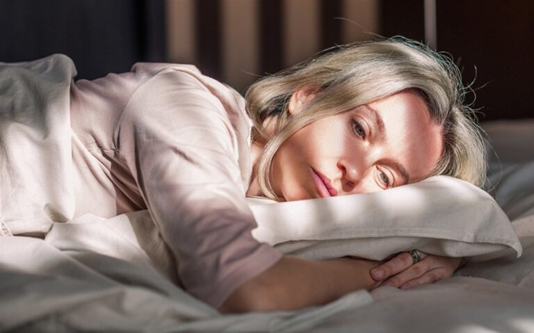
Blue – Peace, Trust, and Melancholy
Blue is one of the most beloved colors across cultures, and it’s not hard to see why. It’s the color of the ocean and the sky—vast, soothing, and full of quiet power. Emotionally, blue evokes trust, honesty, and calm. Lighter shades like baby blue or sky blue are especially calming, while deeper blues like navy or indigo suggest depth, stability, and wisdom.
At the same time, blue carries a reflective, even somber quality. It can represent longing, solitude, or the kind of sadness that leads to deeper insight. That’s why we say “feeling blue” during emotionally tender times.
Use blue to soften emotional intensity. It’s a wonderful color to wear to interviews, keep in your workspace, or bring into your evening routine. Try a deep blue journal, a blue-gray comforter, or soft blue curtains to help you feel emotionally held.
Green – Renewal, Balance, and Growth
Green is the color of life unfolding. It’s springtime, fresh air, and the slow rhythm of leaves in the wind. Emotionally, green is the color of restoration. It’s ideal when you’re navigating change or rebuilding after stress or heartbreak.
Because green sits in the center of the color spectrum, it naturally evokes equilibrium. It supports emotional healing by reminding you that growth takes time and that peace is possible even in uncertain seasons.
Spending time in green spaces—like gardens, forests, or parks—has been shown to lower cortisol (the stress hormone) and increase feelings of contentment. Even visual exposure to green—through paint, houseplants, or images—can quiet the nervous system.
Wear green when you’re trying to ground yourself or bring a sense of calm growth into your life. A soft sage sweater, a dark green bathrobe, or even green nail polish can give your nervous system a gentle hug.
Purple – Mystery, Spirituality, and Creativity
Purple is the color of dreams, intuition, and imagination. It bridges the energy of red with the serenity of blue, creating a hue that feels both grounded and otherworldly. Emotionally, purple speaks to the soul—it opens space for reflection, meditation, and deep emotional connection.
Light purples like lavender and lilac are known for their soothing, almost therapeutic qualities. They’re often used in aromatherapy, spas, and healing spaces. Deeper shades like plum or eggplant evoke mystery, sensuality, and the richness of your inner world.
Purple is an ideal color for when you’re journaling, meditating, or creating art. It helps connect you to your intuition and unlock your imaginative potential. If you’re in a season of self-discovery, spiritual growth, or healing from heartbreak, purple can offer comfort and quiet transformation.
Incorporate purple through candles, meditation pillows, stationery, or even amethyst crystals placed near your bed or desk.
Neutrals and the Emotional Undercurrent
Neutral colors might not shout for attention, but they hold powerful emotional energy just beneath the surface. Unlike bold hues that immediately spark a reaction, neutrals offer subtle emotional support. They are grounding, stabilizing, and often act as the emotional glue in our environment—helping to balance more vivid tones while quietly influencing our moods.
Neutrals are often chosen intuitively when we’re seeking calm, clarity, or safety. These shades rarely overwhelm the senses, which is why they’re common in minimalist aesthetics, therapy rooms, and sacred spaces. Each neutral color carries its own quiet emotion—whether it’s the fresh start of white, the protective cloak of black, the quiet stillness of gray, or the earthy embrace of brown.
Let’s look more closely at what each one means and how to use them to support your emotional landscape.
White – Purity, Simplicity, and Clarity
White symbolizes a clean slate. It brings with it a sense of openness, possibility, and mental clarity. Emotionally, white represents peace, new beginnings, and even spiritual reflection.
You might find yourself drawn to white when you’re starting over, letting go, or craving simplicity. White creates space—both physically and mentally. It’s a breath of fresh air when everything feels too loud.
Incorporate white through minimal design, light fabrics, or a simple white candle in your meditation space. It can help you reconnect with your values, declutter your mind, and breathe deeply again.
Black – Protection, Mystery, and Strength
Black is often misunderstood. While it’s linked to mourning and heaviness, it’s also a color of strength, grounding, and personal boundaries. It’s the color of night, of the unknown, and of deep introspection.
Emotionally, black can provide a sense of power and control—especially when everything else feels uncertain. It allows you to retreat and collect your thoughts. But if overused, it may feel isolating or closed off.
Use black to feel rooted and strong: a black journal for your most private reflections, a sleek black outfit to reclaim confidence, or black accents to create emotional containment in overstimulating spaces.
Gray – Neutrality, Calm, and Uncertainty
Gray sits between the absolutes of black and white, offering balance, subtlety, and quiet contemplation. It often evokes wisdom and maturity—but also, at times, emotional ambiguity or numbness.
You may turn to gray when you’re seeking peace without drama. It’s a color for the in-between—moments of reflection, pause, or recalibration. However, too much gray can feel emotionally flat or uninspiring, so it benefits from being paired with a color that lifts your energy.
Add gray in your workspace to boost concentration, or in your wardrobe when you need to feel composed and unbothered. Just remember to layer in a touch of warmth if it starts to feel emotionally distant.
Brown – Stability, Warmth, and Grounding
Brown is the color of the earth beneath your feet—the root, the foundation, the constant. Emotionally, brown speaks to safety, reliability, and deep comfort. It’s the color of hot cocoa on a rainy day, or the wood of a well-loved table.
When life feels unpredictable, brown can bring you back to yourself. It’s nurturing, honest, and dependable. People who feel overwhelmed by too much change or chaos often find solace in earthy tones.
Use brown in cozy textiles, natural materials like wood and leather, or in grounding practices like sitting beneath a tree or gardening. It invites you to return to your core and feel supported.
Using Color to Support Emotional Healing
Now that you understand how colors affect your emotions, how can you use them purposefully?
Here are some easy and intentional ways to incorporate color into your emotional wellness:
-
In your wardrobe: Wear blue on anxious days, red when you need a boost, or white when you’re starting something new. Let your outfit reflect your emotional needs—not just your style.
-
In your home décor: Use warm colors to energize social spaces like the kitchen or living room. Cool hues like blue and green work well in bedrooms or reading nooks.
-
In your journaling practice: Choose colored pens or pages that match your mood. Yellow for gratitude entries. Purple for spiritual reflections. Black for emotional release.
-
In art or creative expression: Let your emotions guide your color choices when painting, crafting, or designing. Use bold, warm colors for catharsis—or calming tones for grounding.
-
In mindfulness and visualization: Close your eyes and imagine a calming blue light washing over you. Or picture a golden yellow sun filling your chest with joy. Color can guide emotional visualization and energetic release.
Feel Your Feelings in Full Color
Your emotions are not random. They have texture, temperature, and—even if you’ve never thought about it—color. Exploring the relationship between colors and emotions can help you understand yourself better. It offers you a language to describe how you feel, and a palette to support how you want to feel.
So today, pause for a moment. Look around your room. Look at what you’re wearing. What colors are present? What colors are missing?
And more importantly—how do they make you feel?
Because once you start noticing the emotional messages of color, you’ll never look at the world the same way again.